 | ||
Image #1
|

For creative purposes, beauty is in the eye of the beholder. To make enhancements to one plain image I'll composite it with a second image using Adobe Photoshop. The two images combined will result in one final 'artsy' image.
Step 1: Select two images. One should have some texture to it to create interest.
Step 2: Using Photoshop open both images using (File | Open) commands from the menu bar. Check the image size of each file to make sure the resolution is the same for both via the (Image | Image size) from the menu bar. If resolution sizes are different choose the file that has the larger file size and size to match the smaller of the two.
*Note: if you intend to print the final file, as opposed to
displaying it on web platforms, make sure the resolution is at least 150 pixels per inch for a up to 8x10 print. If a bigger printout is desired use 300 pixels per inch. Most digital cameras have file size settings to select large for larger source files.
 Step 3: With one image selected, go to select all function under Select on menu bar. Then copy it (Edit | copy) and paste the selection onto the other image (Edit | paste). The result will be two layers on one file.
Step 1: Select two images. One should have some texture to it to create interest.
Step 2: Using Photoshop open both images using (File | Open) commands from the menu bar. Check the image size of each file to make sure the resolution is the same for both via the (Image | Image size) from the menu bar. If resolution sizes are different choose the file that has the larger file size and size to match the smaller of the two.
*Note: if you intend to print the final file, as opposed to
displaying it on web platforms, make sure the resolution is at least 150 pixels per inch for a up to 8x10 print. If a bigger printout is desired use 300 pixels per inch. Most digital cameras have file size settings to select large for larger source files.

Step 4: Open the Layers tab under Windows from menu bar. Select one of the layers by clicking in one of the boxes. Whatever box is highlighted in blue is the active layer. Play with the adjustment choices for each layer by choosing from the drop down menu until you find something you like.
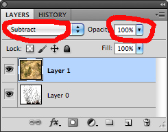 For the selection of adjustments to the grass image Subtract looked the most interesting.
On the right of the Adjustment drop down menu choices, an opacity bar allow for further levels of adjustments. The Subtract choice made the brown color blue and reminded me of 'Starry Night' by Vincent van Gogh. The grass image looked like etching against the white space from the tree image.

You can continue to explore different effects and levels of adjustments. Once you are happy with the results, it's best to 'flatten' the layers. This collects all the separate layers and condenses the files size. To do so, go to the Layers tab and scroll down to (Flatten | Image).

The possibilities are varied depending on how many images and layers are used combined with adjustments for each element.
 |
| 'Starry Night' Vincent van Gogh |
Like any new tool you've never worked with before, the more you explore the PhotoShop program, the more you'll see what the editing features have to offer. It's through practice that a user learns the tools. One final word, always save the new image with a different name. This preserves the original file info in case you wish to use that again. Think of the original file as though it were a negative. You wouldn't want to destroy the source. The new files should be a work in and of itself.
What I most liked about this image was the color blue. It reminded me of Gogh's work. Think how a classic artwork would look if it were done using Photoshop.
I wish I had this when I took ICM 502-- I was brand new to photoshop at the time! Great job on this. It's thorough and easy to follow :)
ReplyDeleteGreat job! This was easy to read and very engaging especially with the images strategically placed for further clarity. The final image of your work came out beautiful and indeed looks like van Gogh.
ReplyDelete